A more intuitive way of searching.
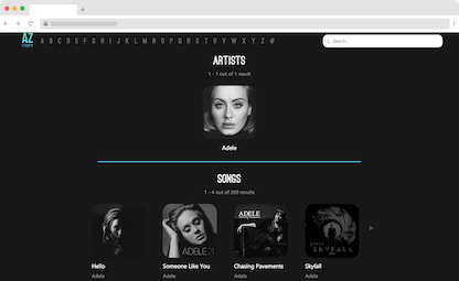
The search bar is made bigger and better so users can click on it right away.

This modern redesign of AZLyrics, ranking top 5 out of 37 redesigns in an intro course to web development, revamps the usability and aesthetics of the once-popular lyrics website.
PLAY WITH PROTOTYPE
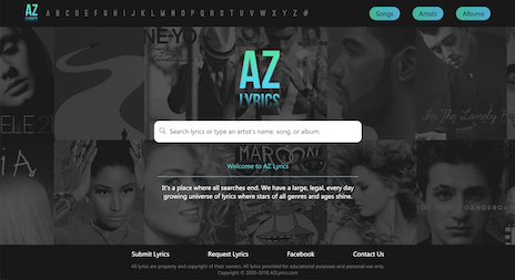
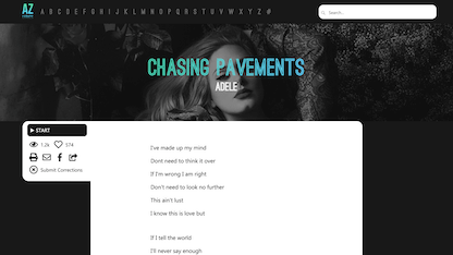
The downfall of AZLyrics, one of the most popular websites for searching lyrics in the early 2000s, is attributed to its outdated design failing to adhere to major design principles. As a redesign exercise, this project hopes to renovate the existing product by reimagining it as a modern website. By focusing on the main function of searching and reading lyrics, AZLyrics receives a whole new, refreshing look with enhanced features.

Ag
Ostrich Sans
Ag
Segoe UI Symbol
#53D4F3
#49DEB7
#707070
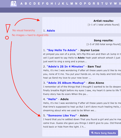
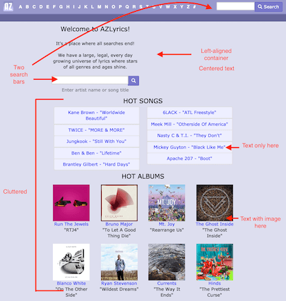
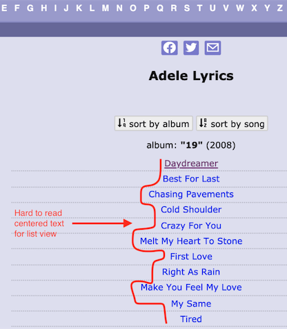
We evaluated the existing website and uncovered critical design problems.
From the get-go, the homepage is cluttered with unnecessary features that overshadow the main function of searching.
Hierarchy is lacking when it comes to delivering information, leaving the user guessing where to click next.
Parts do not align with each other, breaking the eye flow and making the information harder to digest.
New design adds a modern feel and emphasizes function.
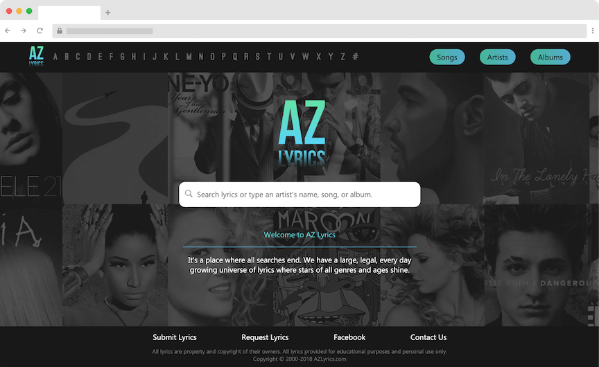

The search bar is made bigger and better so users can click on it right away.
Lyrics are easier to read through the highlighter function that plays along with the music.
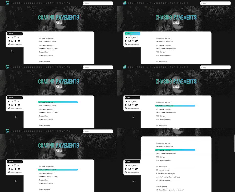

Enhance your singing experience with this techno gradient design.
https://sheenagonzalez.github.io
https://linkedin.com/in/sheena-gonzalez
Sheena Gonzalez
Charlyn Manuyag
Amanda Wu
Adobe XD
HTML/CSS
JavaScript
Branding
Gathered mood boards for theme ideation and defined styles including logo, fonts, and colors
UX Designer
Designed and prototyped home and lyrics pages
This redesign of AZLyrics was created as a mid-semester project for a student-run course, CS198: Web Design and Development in Fall 2018. It was chosen to be showcased as part of the top five projects in a class of 111 students.